What Is a Lower Third? A Creator's Guide for 2026
Other

A lower third is a graphic overlay placed in the bottom 10 to 15% of a video frame to add context, like a speaker’s name and title, without covering the main action. In short-form video, that small strip of information matters more than most new creators realize.
You’ve probably felt the problem already. A podcast clip pops up in your feed, the speaker sounds smart, the framing is clean, the captions are on, but you still don’t know who’s talking. If the video doesn’t tell you fast, you’re forced to do extra work. Few will.
That’s why knowing what is a lower third isn’t just broadcast trivia. It’s practical editing knowledge. A good lower third answers the viewer’s first silent question: Who is this, and why should I care? For creators repurposing interviews, webinars, YouTube videos, and podcasts into shorts, that answer often decides whether someone keeps watching or scrolls away.
If you make social clips regularly, this sits in the same category as captions, framing, and hook selection. It’s one of the small production choices that changes how polished your content feels. If you want more tools that help with that kind of creator workflow, Klap’s tools for creators resources are worth browsing.
Introduction Why You Need to Know Who's Talking
Short-form video moves fast. The viewer lands on a clip mid-thought, often with no intro, no setup, and no reason to recognize the face on screen. That’s normal on TikTok, Reels, Shorts, and LinkedIn.
A lower third fixes that context gap without interrupting the clip. Instead of asking the audience to figure things out from clues, you state the essentials on screen in a place that doesn’t fight the main image.
Practical rule: If a viewer needs to guess who the speaker is, the edit is making them work too hard.
This matters most when you’re slicing long-form content into highlights. In the original podcast or interview, viewers had a full introduction. In the short clip, they don’t. The lower third becomes the replacement for that missing setup.
Used well, it makes the clip feel intentional. Used badly, it feels like clutter pasted on top of a video. The difference usually comes down to clarity, timing, and restraint.
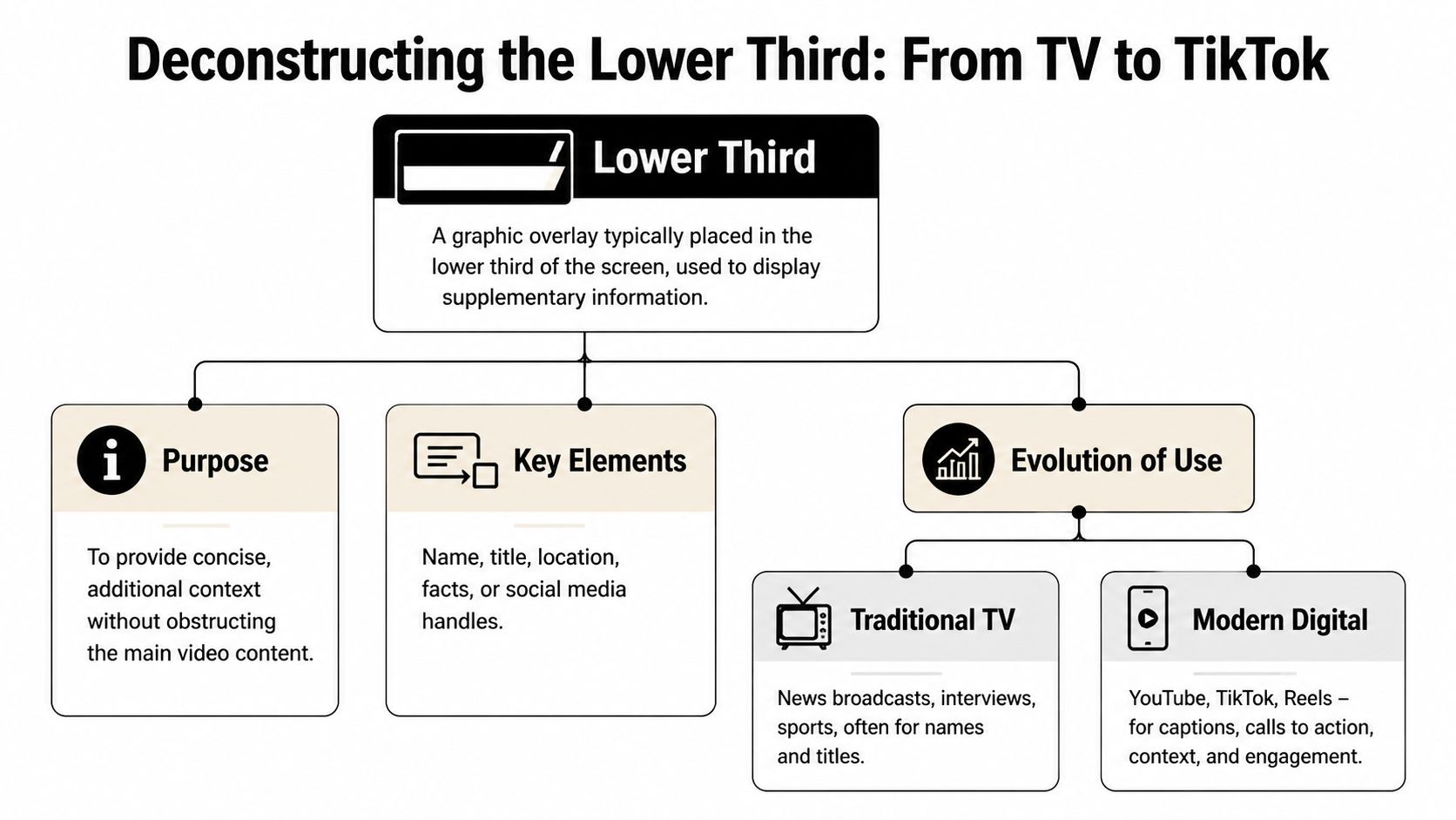
Deconstructing the Lower Third From TV to TikTok
A lower third is best understood as a context layer. It’s not the star of the screen. It’s the label on the package. The main footage carries the emotion and message, while the lower third gives the viewer just enough supporting information to follow along.
In professional video, that overlay usually lives in the lower area of the frame so it stays out of the way of the subject’s face and other important visual details. That placement became standard long before social video existed.
Where the term came from
The format goes back to the 1970s, when the Chyron Corporation’s Chiron I character generator helped digitize on-screen broadcast graphics. That system became so influential that “chyron” turned into the standard North American term for lower thirds, and the label stuck even as the tools changed. The same source also notes the common tier structure still used today: one-tier, two-tier, and three-tier lower thirds (Wikipedia’s lower third overview).
That history matters because it explains why lower thirds still feel familiar. Viewers have been trained by decades of television to read that space for identification and context. Social video didn’t invent the format. It borrowed it and made it faster.
The three common types
Not every lower third does the same job. Most of the confusion comes from treating them as one thing.
TypeBest useExample
One-tier
Quick identification
Topic label, location, segment title
Two-tier
Person plus role
Name on top, title or company below
Three-tier
Extra context
Name, role, plus time, place, or segment note
The two-tier version is the one most creators should care about. It’s the default choice for interviews, expert clips, founder videos, customer stories, and educational talking-head content because it answers the two key questions immediately: who the person is and why they’re relevant.
A one-tier lower third works when the speaker is already known, but the clip still needs orientation. You might use it to mark a location, a series name, or a discussion topic.
A three-tier version can be useful, but it’s easy to overdo. In social formats, extra information often turns into visual traffic. If the third line isn’t helping the viewer understand the clip right away, it’s usually better cut.
The best lower thirds feel almost invisible. The viewer gets the information, then returns to the speaker.
Broadcast logic still works on mobile
What changed from TV to TikTok isn’t the purpose. It’s the pace. Broadcast lower thirds were designed for live information flow. Social lower thirds need to work inside a compressed attention window where viewers decide fast whether a clip deserves another second.
That’s why modern creators should think of lower thirds less as a TV relic and more as a trust signal. They tell the viewer that the clip has been edited with intention, the speaker has an identity, and the content is worth paying attention to.
Why Lower Thirds Boost Engagement on Social Video
On social platforms, context is part of the hook. A strong sentence from a podcast guest lands differently when the viewer knows whether they’re hearing a founder, a coach, a journalist, or a customer.
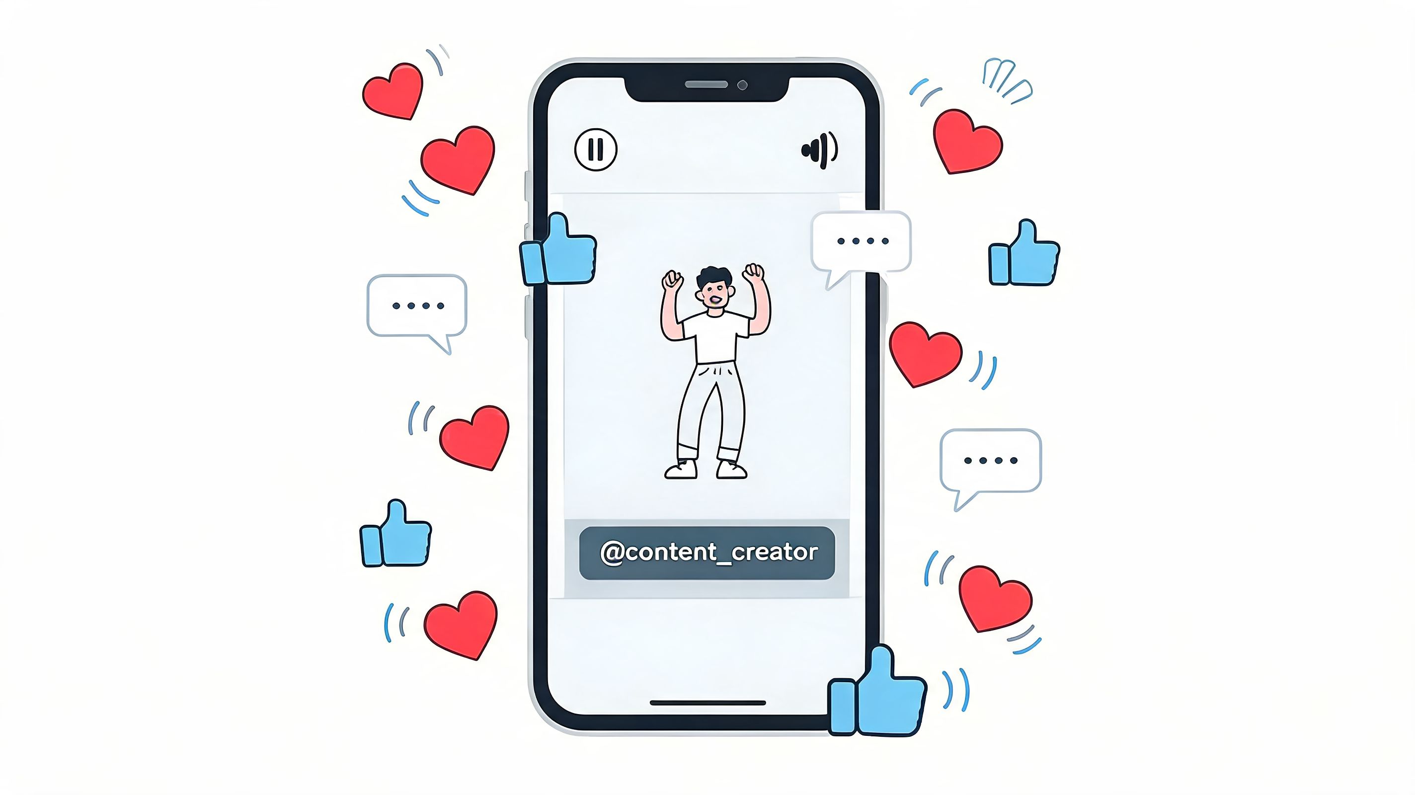
They answer the scroll-stopping question
The first few seconds of a short clip are brutal. The audience is deciding whether this is useful, entertaining, or skippable. A lower third helps because it removes friction. Instead of making people infer authority from tone and appearance, you tell them who’s speaking.
For interview clips, this is one of the biggest reasons clean edits often underperform polished ones. The clip may contain a strong insight, but if the speaker remains unidentified, the video asks the audience to trust a stranger instantly.
They add credibility without sounding self-important
A lower third doesn’t need to be flashy to build authority. In fact, flashy is usually the wrong move. What works is a simple, readable identifier that says this person has a role, a domain, or a reason to be on screen.
That’s especially useful on platforms where clips get reposted and detached from their original context. A name and role help the content survive outside its home channel.
If LinkedIn is part of your distribution mix, it also helps to study broader posting choices that maximize LinkedIn video engagement, because lower thirds work best when they support a platform-specific packaging strategy instead of acting as a decorative add-on.
They reinforce brand consistency
A lower third is one of the easiest places to make recurring content feel unified. Font choice, color treatment, spacing, and animation style all signal whether the clip belongs to a creator or brand with a system.
That doesn’t mean every video needs a branded banner screaming for attention. It means the viewer should start recognizing your visual language over time.
Here’s a useful reference for the pacing side of social video editing:
The practical takeaway is simple. On social, lower thirds aren’t just informational. They shape trust, clarity, and the first impression of the edit.
Designing Lower Thirds That Capture Attention
Most lower third mistakes come from one bad instinct: trying to make the graphic itself impressive. The job isn’t to impress. The job is to be understood quickly.
Professional guidance is fairly clear on what works. Lower thirds should sit in the title-safe lower area, roughly the bottom 10 to 15% of the frame. For vertical 9:16 shorts, two-tier lower thirds can boost retention by 15 to 20% on TikTok and Reels when they provide instant context. A readable setup uses a sans-serif font, with 24 to 36pt for the name and 18 to 24pt for the title, keeps contrast above 4.5:1, and limits animation to a 1 to 2 second slide-in or fade (StudioBinder’s lower third guide).

What to do
A good lower third is built on a few boring decisions. That’s a compliment.
- Use sans-serif type: Helvetica Neue, Inter, and similar fonts work because they stay readable at speed and at small sizes.
- Keep the hierarchy obvious: Put the person’s name on the first line. Put the role, title, or location underneath.
- Make contrast do the heavy lifting: White text with a dark backing, shadow, or subtle plate usually beats trendy low-contrast color combinations.
- Animate lightly: A short slide or fade feels polished. Anything more starts competing with the footage.
- Design for the crop: A lower third that works in a widescreen interview can fall apart in a vertical export.
Editing instinct: If the viewer notices the animation before they read the text, the motion is too loud.
What to avoid
Some lower thirds fail even when they look expensive.
- Don’t write a mini biography: A lower third is not the place for a sentence-long credential stack.
- Don’t crowd the bottom of the frame: Captions, progress bars, app interface elements, and lower thirds all fight for the same real estate.
- Don’t place it by habit: If the speaker’s hands or important product demo lives low in frame, the standard position may need adjustment.
- Don’t use brand colors blindly: A brand palette that looks great on a website can become unreadable over live footage.
A simple working formula
For most creator content, this formula holds up well:
- Line one: Speaker name
- Line two: Why the viewer should care
- Animation: One quick entrance, then stay still
- Exit: Leave cleanly or stay on only as long as needed
That second line matters more than people think. “CEO” can be useful. “Founder, B2B sales coach” is usually more useful. The role should orient the viewer, not just flatter the speaker.
Social video has one extra constraint
On social, your lower third doesn’t live alone. It shares the frame with burned-in captions, platform UI, and often a tighter crop than the original footage. That’s why creators who make lots of shorts should preview designs on actual phone screens, not just in Adobe Premiere Pro or After Effects.
If you’re still building your short-form editing stack, this list of best TikTok editing apps can help you compare what different tools handle well.
A lower third should feel like a seatbelt, not a costume. It’s there to support the ride, not become the whole experience.
How to Add Lower Thirds Automatically with Klap
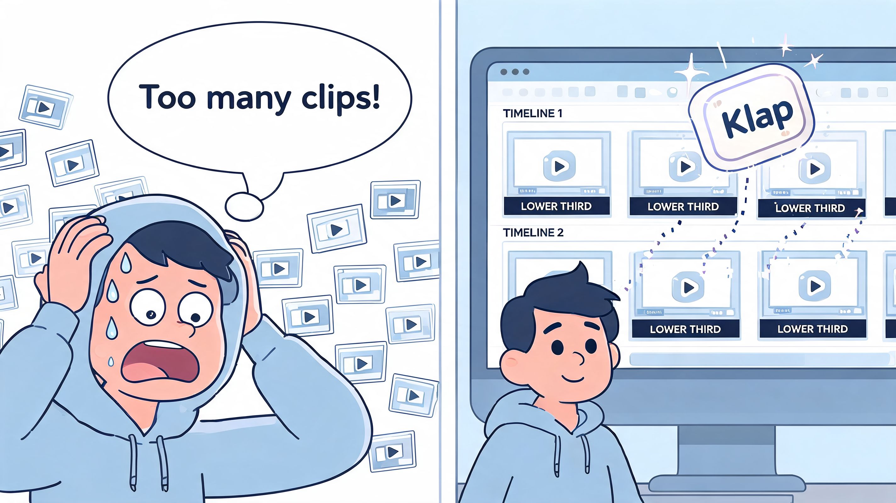
The hardest part about lower thirds isn’t designing one nice template. It’s applying them across a volume workflow without losing consistency.
That’s where automation becomes useful. If you’re repurposing a podcast, webinar, interview, or YouTube episode into multiple shorts, manually building a fresh lower third for every clip gets old fast. You’re repeating identification work instead of spending time on hooks, pacing, and story selection.
Where automation helps most
Klap is built around turning long-form video into social-ready clips. In that workflow, lower thirds fit naturally alongside reframing, captions, and clip packaging.
A practical setup usually looks like this:
- Import the source video: Upload a file or bring in a YouTube link.
- Let the system prepare clips: The platform identifies strong segments and formats them for social viewing.
- Review the packaging: Edit text, timing, and visual treatment so the clips feel consistent with your brand.
- Export without rebuilding everything by hand: That’s a major time saver.
For creators trying to streamline your content workflow, this kind of system matters because it reduces repetitive editing decisions. You still need judgment. You just don’t need to drag the same text box around twenty times.
The real advantage
The benefit isn’t that automation makes every design choice for you. It’s that it handles the repetitive production layer so you can focus on whether the clip works.
If you want to test that kind of workflow directly, Klap’s AI short video generator shows the core idea. Start with long-form content, generate short clips, then refine the details that shape how professional the final video feels.
Your Next Steps to Professional-Looking Videos
A lower third is a small graphic with a big job. It gives the viewer context, protects clarity, and makes a short clip feel finished instead of merely extracted.
The useful mindset is to stop treating lower thirds like decoration. They’re editorial tools. They tell the audience who’s speaking, why the person matters, and how much care went into the edit.
Keep asking one question while you edit: does this text help the viewer understand the clip faster?
If the answer is yes, keep it. If it’s only there because “professional videos have graphics,” cut it or simplify it.
The best next step is practical. Review your last five short clips and look for moments where the audience had to infer context. Those are your lower-third opportunities. Fixing them doesn’t require a full rebrand or a motion design overhaul. It usually requires one clean template, better timing, and the discipline to keep the information brief.
If you’re ready to turn long videos into polished short clips faster, Klap makes the repurposing process much easier with AI-powered clipping, reframing, captions, and social-ready formatting.
